


Purpose
SAP GUI input fields are user elements for entering or modifying data like document numbers, material codes, quantities, or dates. They offer value help (F4), default values, and real-time validation for accurate entry, enabling user interaction for tasks like creating sales orders, accessing material master data, or running reports. These fields support text, numbers, dropdowns, calendar access, barcode scanning, and search.
You can enhance these fields with different options provided by the input field command.

Note: You can specify the position of an input field in different ways. Click here for details about positioning the screen elements.
Syntax
You can create an input field at the desired position with a label and required functionality.
inputfield([startrow,startcol],"Label name",[endrow,endcol],{"name":"value","size":value,"option":value…});
Properties
- startrow, startcol, endrow, endcol - Coordinates for placement
- Label name - Visible name of the push button
- @0Y@Label name - Name of the field with icon
- @4V\\Qlabel Tip@Label name - Name of the field with tooltip and icon
Available Options
You can use the following options with the input field command:
|
"alignright":true - Aligns the user's input to the right edge of the input field. |
|
|
"date":true - Displays calendar for an input field. |
|
|
"default":"string" or "default":value - Enables users to add default text to the input field. |
|
|
"invisible":true - Hides the input field value with asterisks. |
|
|
"leadingspace":true - Retains any spaces included in the text entered in the input field. |
|
|
"maxlength":value - Defines the maximum input length for an input field. |
|
|
"name":"field_variable_name" - Defines the variable name by which the field can be referenced. |
|
|
"nolabel":true - Hides the label of the field on the screen. |
|
|
"numerical":true - Restricts input type to numbers. |
|
|
"readonly":true - Disables data entry into the input field. |
|
|
"required":true - Makes the field entry mandatory. |
|
|
"searchhelp":"value" - Provides list of available entries for an input field. |
|
|
"size":value - Specifies the size of textfield of an input field. |
|
|
"techname":"value" - Replicates searchhelp functionality. |
|
|
"uppercase":true - Displays the user-entered input in uppercase. |
|
|
Add tips and icons to an input field |
|
|
Global variables and screen variables can be used with input fields. |
Options Detail
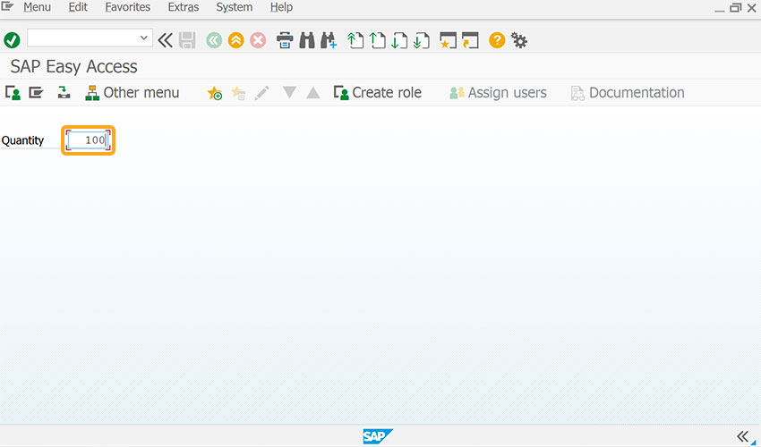
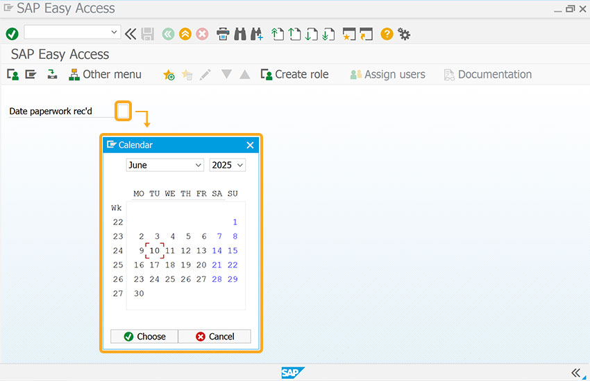
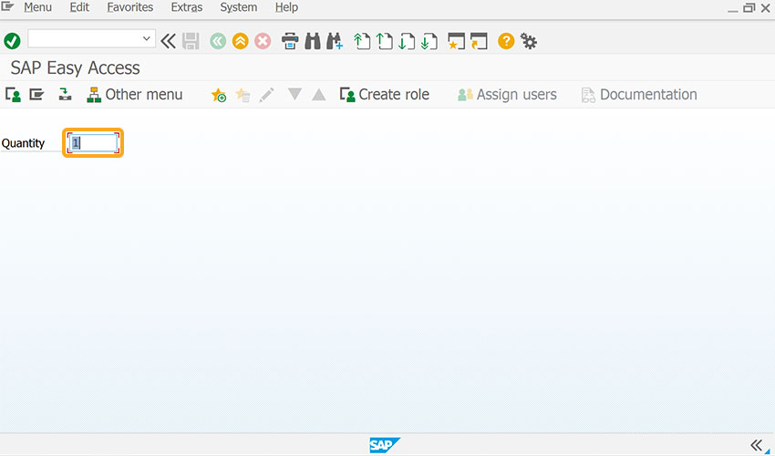
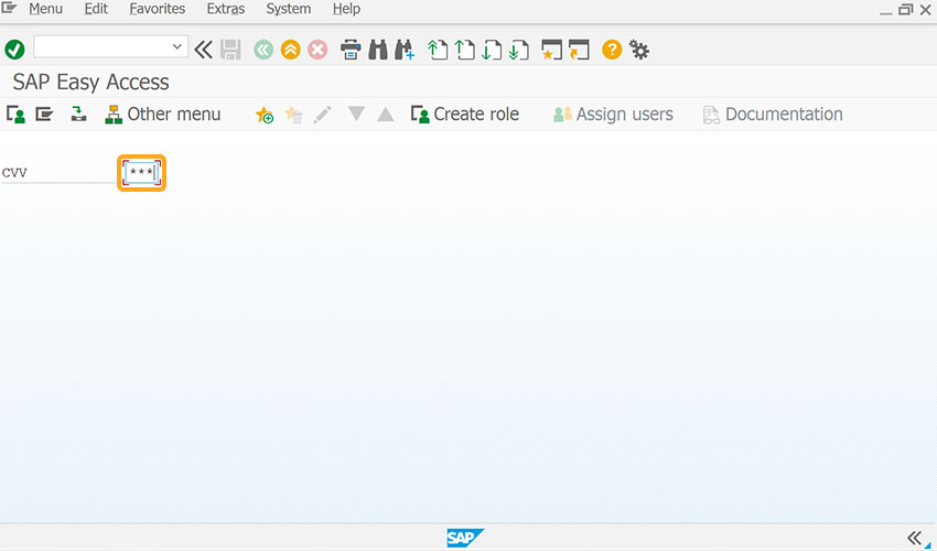
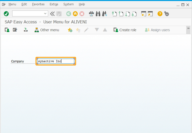
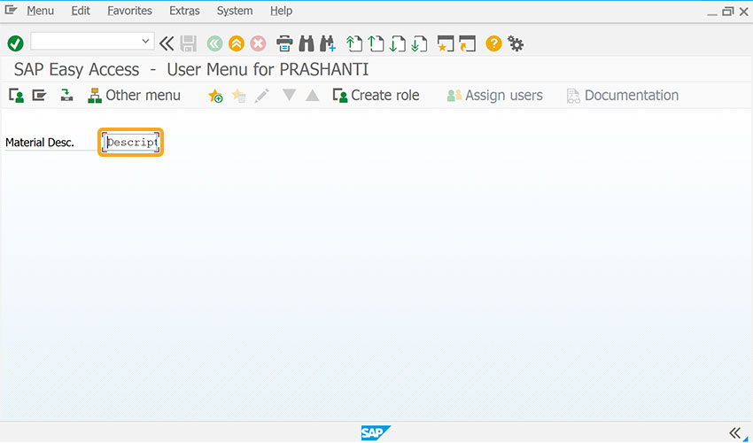
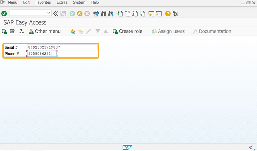
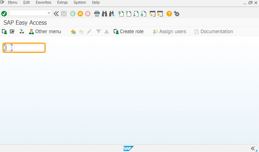
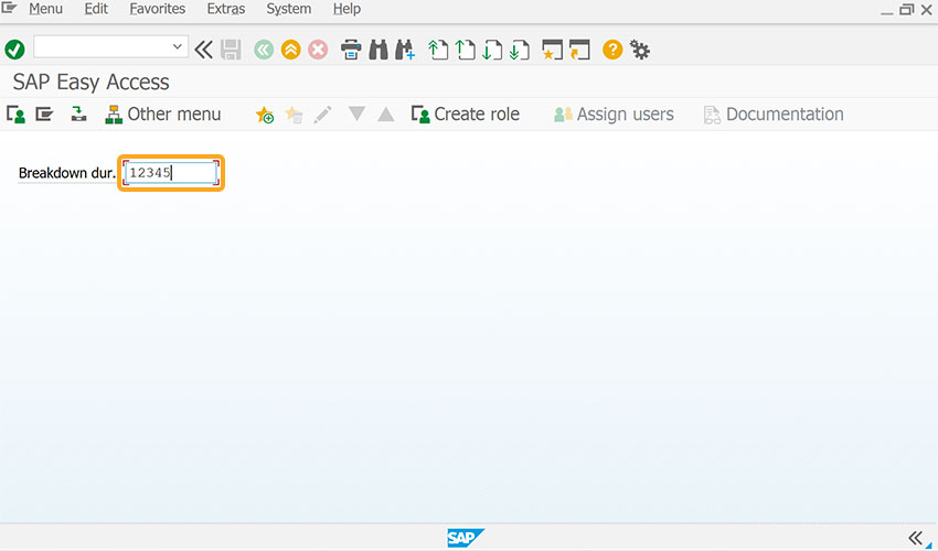
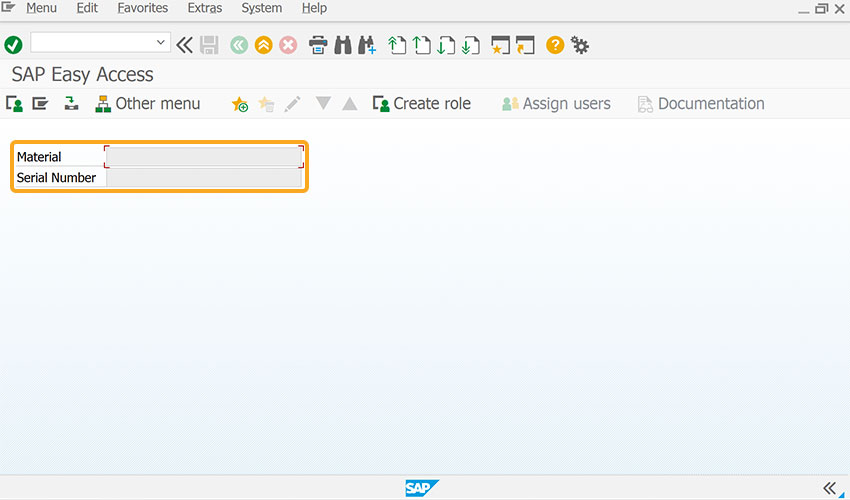
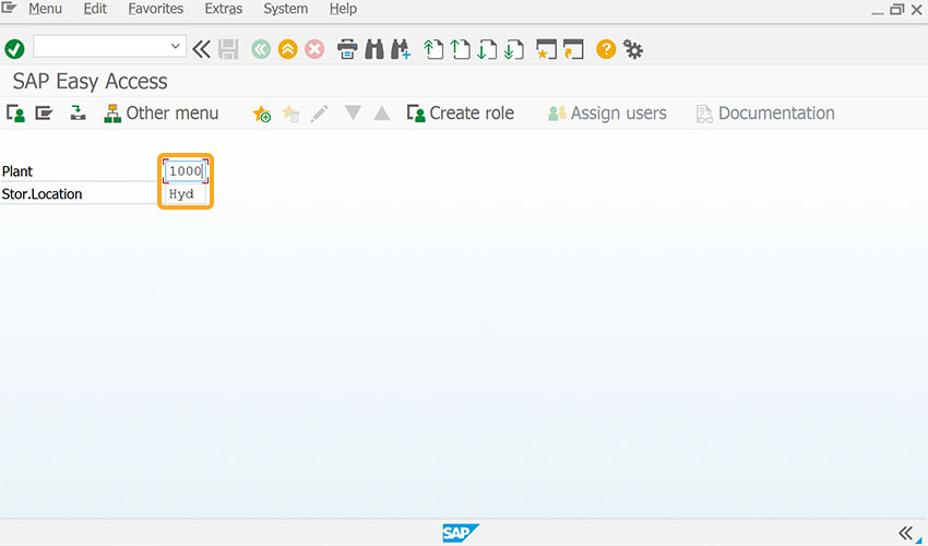
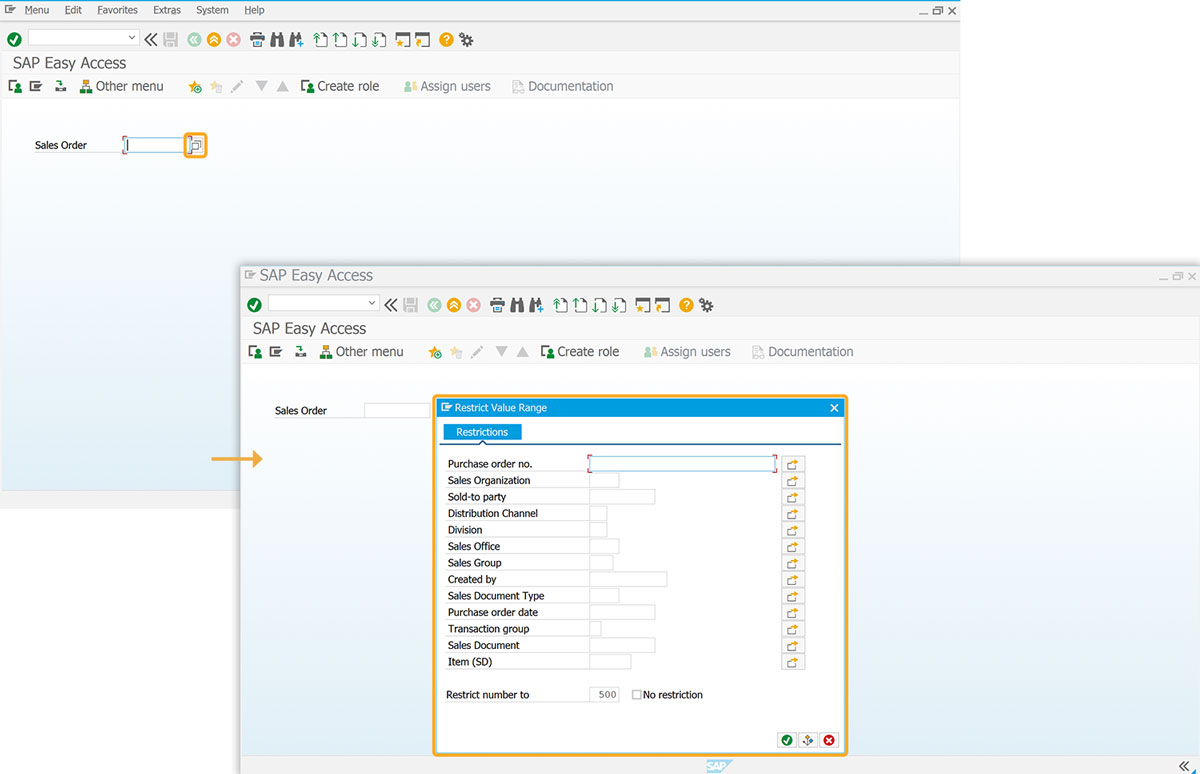
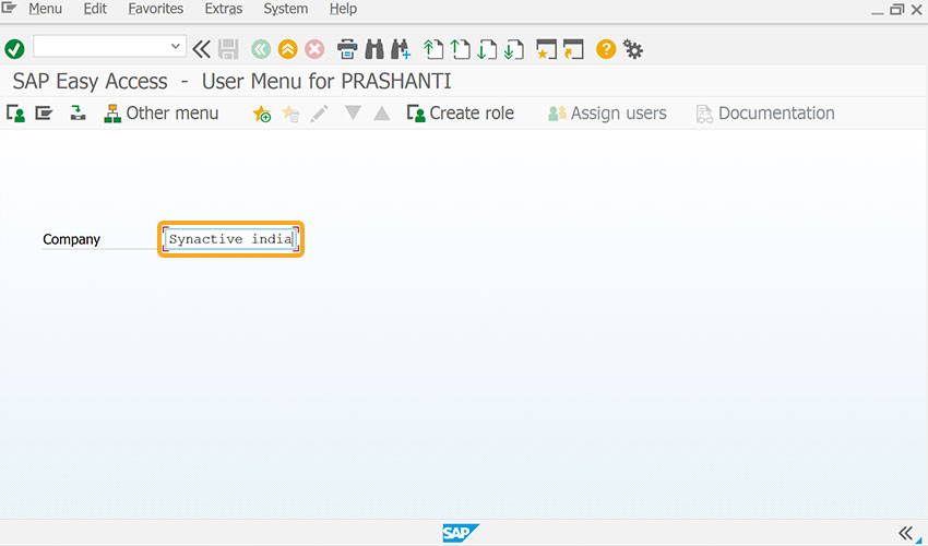
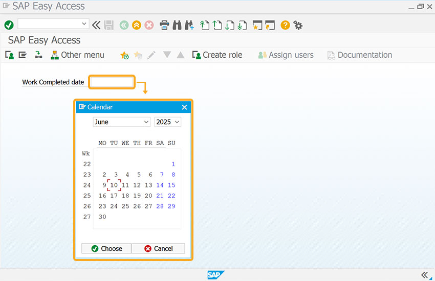
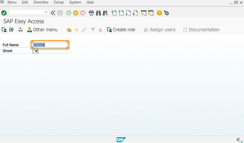
In addition to the mentioned options, Liquid UI WS offers additional functionalities that can be linked with the input field. These capabilities include:
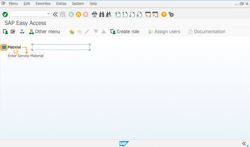
Example
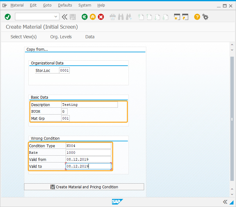
The following example demonstrates how the input field() is used to create material with a price constraint for a given period.
//Creates four input fields
inputfield([19,28],"Condition Type",[19,43],{"name":"z_vk11_conditiontype","size":20});
inputfield([22,29],"Valid to",[22,43],{"name":"z_vk11_validto","size":20});
inputfield([21,29],"Valid from",[21,43],{"name":"z_vk11_validfm","size":20});
inputfield([20,29],"Rate",[20,43],{"name":"z_vk11_rate","size":20});
Click here for details about how to customize the create material screen.
Tips and Tricks
Adding quickinfo
A quickinfo can be added to the input field using the input field command by labeling the name with an icon and tip.
//Create the SAPLSMTR_NAVIGATION.E0100.sjs file inside your script folder for customizing the SAP Easy Access Screen
//Now, add the Liquid UI script to the above file and save it
- Create an input labeled Reference Number.
// Creates input field labeled Reference Number
inputfield([1,0],"Reference Number",[1,25],{"name":"Z_ZMBE_REFNUM","size":10,"maxlength":"10"});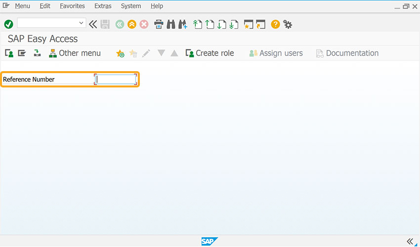
- Add a tooltip to the input field to add contextual information for the user.
// dds tooltip to the input field
inputfield([1,37],"@01\\Qplease use the external document number as the reference number @Reference Number");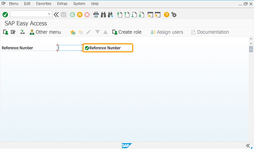
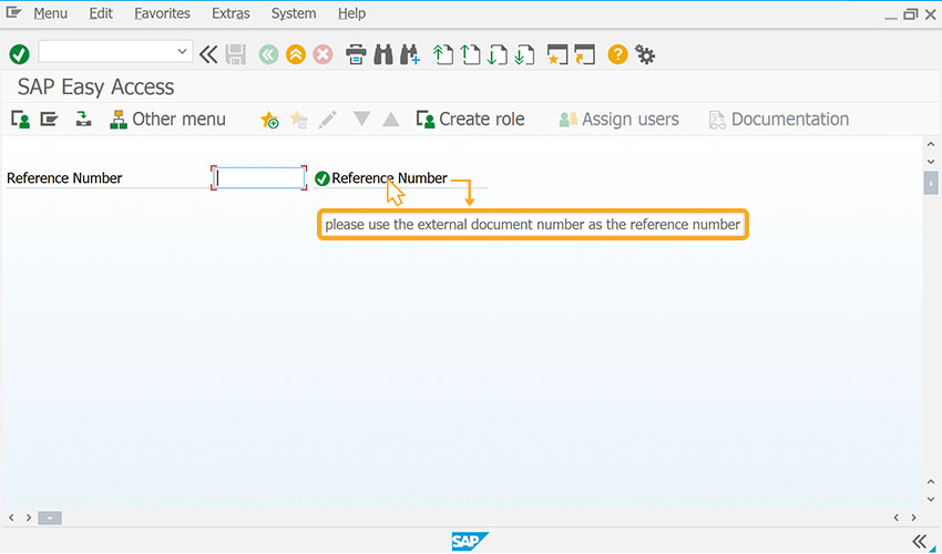
- After refreshing the SAP screen, when the mouse hovers over the Reference Number field, it shows the tip to please use the external document number as the reference number, as shown in the image below.
Displays InputAssisant
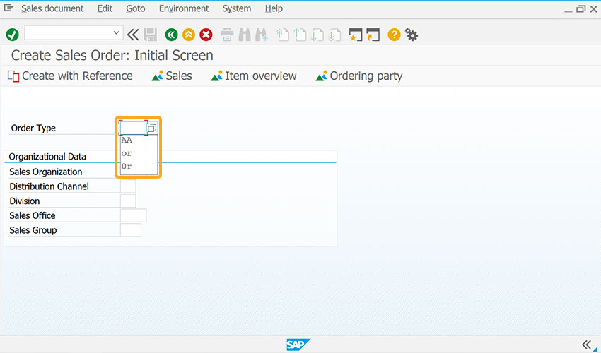
Additionally, the Liquid UI displays the history for your new input fields. To activate this option, enable the historyononlyguixt = true; in guixt.sjs script file and save it. Enabling this option displays the popup history for both the SAP and Liquid UI created controls, as shown in the image below.
Technical Information
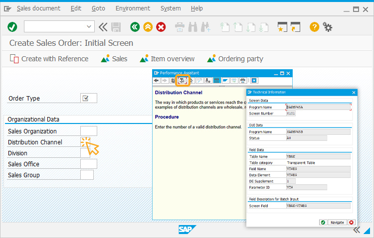
In standard SAP, double clicking on a field opens the Performance Assistant. By clicking the Technical Information icon, you can view the technical details of the field, such as the table name, field name, and screen number—information essential for enabling matchcode (F4 help) functionality.
Usage Details
- Assign barcode scanning feature using inputfield
- F4 searchhelp on Liquid UI inputfield
- Add a calendar date picker to inputfield
- Searchhelp for inputfield.
- Translate text to other language with inputfield
- Convert time from milliseconds to days/hours/minutes/seconds with inputfield
- Validate Japanese Half-Width(Hankaku) Katakana Character using inputfield
- Validate time format, hh:mm:ss in inputfield
- Convert user entered value to decimal format
- Padding a String
- Validating inputfields
- Create localvaluehelp for inputfields.
- Set cursor on the required inputfield.