Liquid UI - Documentation - 5.07 inputfield()

5.07 inputfield()


Purpose

SAP GUI input fields are user elements for entering or modifying data like document numbers, material codes, quantities, or dates. They offer value help (F4), default values, and real-time validation for accurate entry, enabling user interaction for tasks like creating sales orders, accessing material master data, or running reports. These fields support text, numbers, dropdowns, calendar access, barcode scanning, and search.

You can enhance these fields with different options provided by the input field command.

 

Note: You can specify the position of an input field in different ways. Click here for details about positioning the screen elements.


Syntax

You can create an input field at the desired position with a label and required functionality.

 
inputfield([startrow,startcol],"Label name",[endrow,endcol],{"name":"value","size":value,"option":value…});
 

Properties

  • startrow, startcol, endrow, endcol - Coordinates for placement
  • Label name - Visible name of the push button
  • @0Y@Label name - Name of the field with icon
  • @4V\\Qlabel Tip@Label name - Name of the field with tooltip and icon

Available Options

You can use the following options with the input field command:


"alignright":".."

"alignright":true - Aligns the user's input to the right edge of the input field.

"date":".."

"date":true - Displays calendar for an input field.

"default":".."

"default":"string" or "default":value - Enables users to add default text to the input field.

"invisible":".."

"invisible":true - Hides the input field value with asterisks.

"leadingspace":".."

"leadingspace":true - Retains any spaces included in the text entered in the input field.

"maxlength":".."

"maxlength":value - Defines the maximum input length for an input field.

"name":".."

"name":"field_variable_name" - Defines the variable name by which the field can be referenced.

"nolabel":".."

"nolabel":true - Hides the label of the field on the screen.

"numerical":".."

"numerical":true - Restricts input type to numbers.

"readonly":".."

"readonly":true - Disables data entry into the input field.

"required":".."

"required":true - Makes the field entry mandatory.

"searchhelp":".."

"searchhelp":"value" - Provides list of available entries for an input field.

"size":".."

"size":value - Specifies the size of textfield of an input field.

"techname":".."

"techname":"value" - Replicates searchhelp functionality.

"uppercase":".."

"uppercase":true - Displays the user-entered input in uppercase.

"Tool tips and icons":".."

Add tips and icons to an input field

"variables":".."

Global variables and screen variables can be used with input fields.

Options Detail

alignright

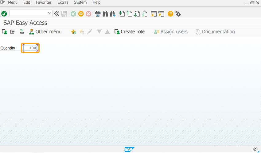
  1. Used to align the value entered in a field to the right edge of that field.
     
    // Creates input field with cursor aligned to right edge
    inputfield([1,0],"Quantity",[1,10],{"name":"z_mb1b_qty","size":5,"alignright":true});
     
    Aligns entered field value to the right edge of the input field
     
  2. As per the code, the cursor in the input field is right-aligned.

date

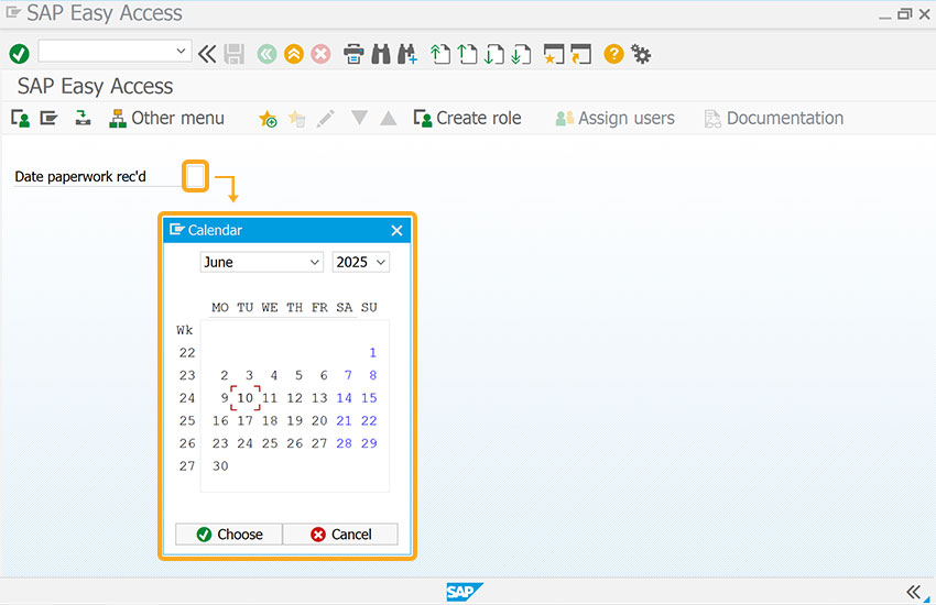
  1. Used to call a calendar with the F4 key instead of searchhelp.
     
    // Adds calendar to the input field
    inputfield({'field':'G[Processing]','offset':[1,1]},"Date paperwork rec'd",{'field':'G[Processing]','offset':[1,22]},{"name":"z_strdt","SIZE":10,"date":true});
    
     
    F4 key opens calendar instead of search help
     
  2. The date field enables the calendar when you click the search option on the input field.
     

    Note: The offset parameter is used for relative positioning.


default

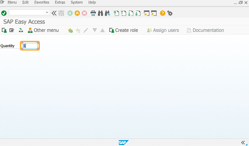
  1. The default option for input fields adds user-specified default text.
     
    // Sets default value in input field
    inputfield([1,0],"Quantity",[1,10],{"name":"z_mb1b_qty","size":6,"default":1});


    Adds user-defined default text to input fields
     
  2. As per the code, the input field Quantity is set to 1 by default. The user can edit the field according to their requirements.

invisible

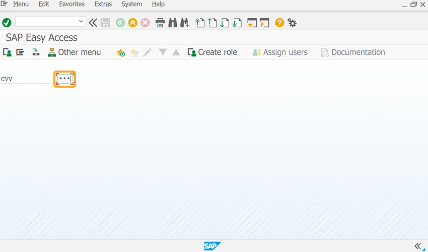
  1. The invisible option for input fields hides the user entered value, as shown in the image below.
     
    // Hides the value entered in input field 
    inputfield( [1,0],"CVV",[1,15],{"name":"CVV","size":3,"invisible":true});
    
     
     Hides user-entered value in input field using invisible option
     
  2. As per the code, the data entered in the input field will be hidden, as we have set invisible to true for CVV in the code.

leadingspace

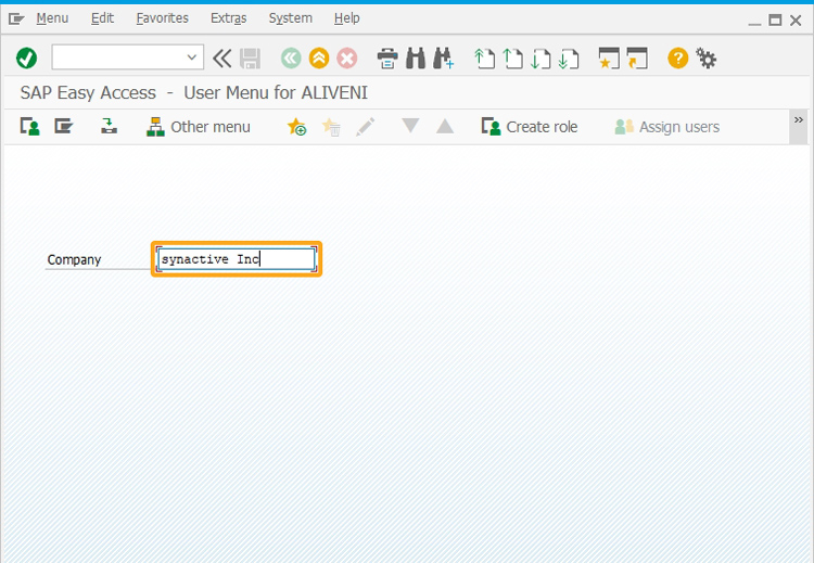
  1. The leadingspace option retains any spaces that may exist before characters are entered in an input field.
     
    // Retains space between text entered
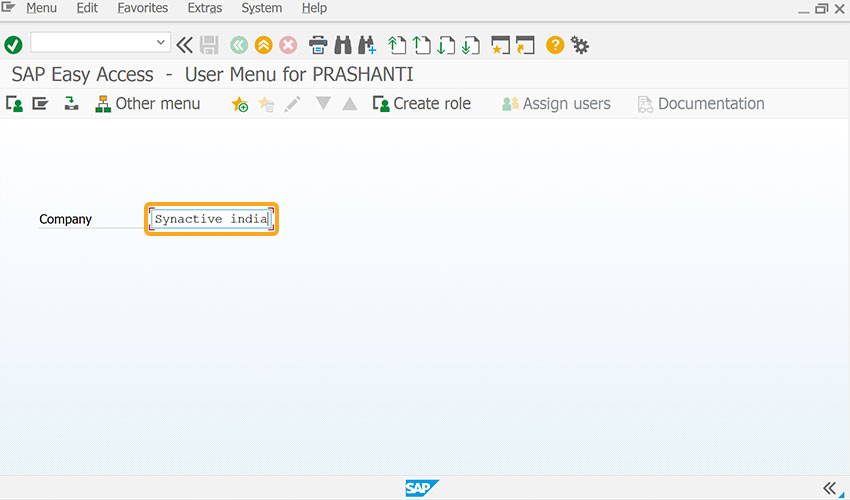
    inputfield( [4,5],"Company",[4,20],{"name":"inpfld_1","size":10,"leadingspace":true});
    
     
    Retains leading spaces before characters in input field
     
  2. This option retained the space you entered between synactive and Inc in the input field, as we have set leadingspace option to true for the company field in the code.

maxlength

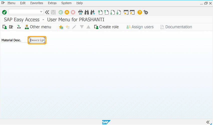
  1. The maxlength option for input fields defines the maximum input to be entered in an input field.
     
    //S ets the length of characters entered in input field
    inputfield([1,0],"Material Desc.",[1,15],{"name":"Z_ZMBE_MATDESC","size":32,"maxlength":"40"});
    
     
    Sets maximum number of characters allowed in input field
     
  2. As per the code, the Material Desc field would allow up to 10 characters.

name

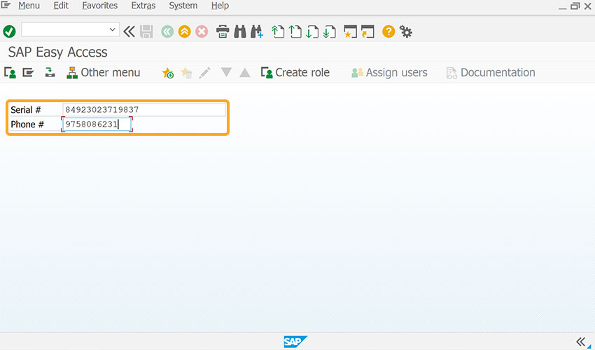
  1. The name option for input fields defines the variable name for the input field.
     
    // Assigns variable name for the input fields
    inputfield([1,0],"Serial #",[1,10],{"name":"z_serial","size":30});
    inputfield([2,0],"Phone #",[2,10],{"name":"z_phone","size":12});
    
     
    Defines variable name for the input field using name option
     
  2. The name option for the input field assigns a name to the variable. The data read in the input field is stored in that particular variable name.

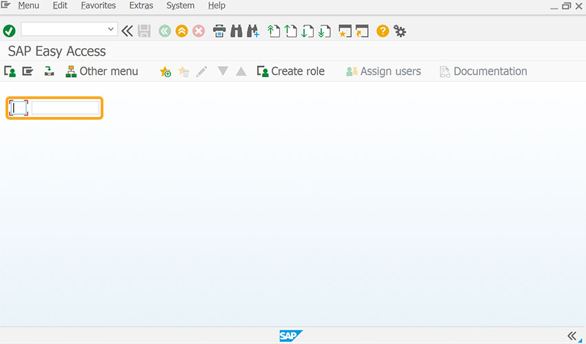
nolabel

  1. The nolabel option for input fields deletes the onscreen label.
     
    //Deletes onscreen label of input field 
    inputfield([1,2],{"name":"z_row_idx","size":2,"nolabel":true});
    inputfield([1,6],{"name":"z_ib03_itemcat","size":12,"nolabel":true});
    
     
    Removes onscreen label from input field using nolabel option
     
  2. Use this option to align extra input fields horizontally or when a label isn't required on the screen.

numerical

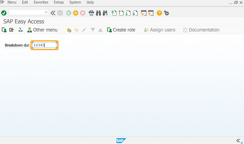
  1. The numerical option for input fields restricts input to numbers.
     
    // Sets to enter only numeric values
    inputfield([1,2],"Breakdown dur.",[1,15],{"size":10,"name":"z_iw42_breakdowndur","numerical":true});
     
    Restricts input field to accept numbers only using numerical option
     
  2. The numerical option allows inputting numbers and symbols without requiring the SHIFT button while blocking alphabetical characters.

readonly

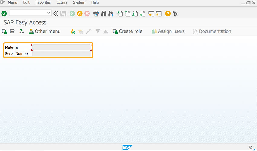
  1. The invisible option hides the user-entered value
     
    // Sets input fields as readonly
    inputfield([1,2],"Material",[1,14],{"name":"g_serviceMaterial","size":25,"readonly":true});
    inputfield([2,2],"Serial Number",[2,14],{"name":"g_serialnumber","size":25,"readonly":true});
    
     
    Hides input field value from view without disabling data entry
     
  2. As per the code, the input field is set as "readonly: true". This prevents the input field from accepting any values when the user attempts to enter data.

required

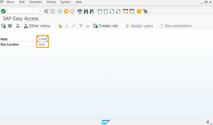
  1. The required option ensures that input is mandatory in the fields.
     
    //Sets input field as mandatory
    inputfield([1,0],"Plant",[1,20],{"name":"z_mm01_plant","size":4,"required":true});
    inputfield([2,0],"Stor.Location",[2,20],{"name":"z_mm01_storloc","size":4,"required":true});
    
     
    Marks input field as mandatory, requiring user input.
     
  2. The required option makes the input field a mandatory field to enter the data.

searchhelp

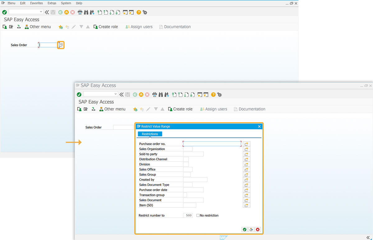
  1. Offers a list of available values for a specific input field.
     
    //Adds searchhelp to the input field 
    inputfield([0,5],"Sales Order",[0,20],{"name":"g_sls_ord_assign","size":10,"searchhelp":"VMVAA"});
    
     
    Displays list of available values for the input field
     
  2. When you click on searchhelp, a list will pop up with all the available entries for the input field.

size

  1. This option specifies the size of the text field of an input field.
     
    //Sets textfield size of input field 
    inputfield( [4,5],"Company",[4,20],{"name":"inpfld_1","size":15});
    
     
    Defines the text field size of the input field
     
  2. As per the code, the size of the text field of the Company input field is assigned as 15.

techname

  1. The techname option for input fields replicates searchhelp functionality and is used when searchhelp is not available.
     
    // Adds technical name to input field 
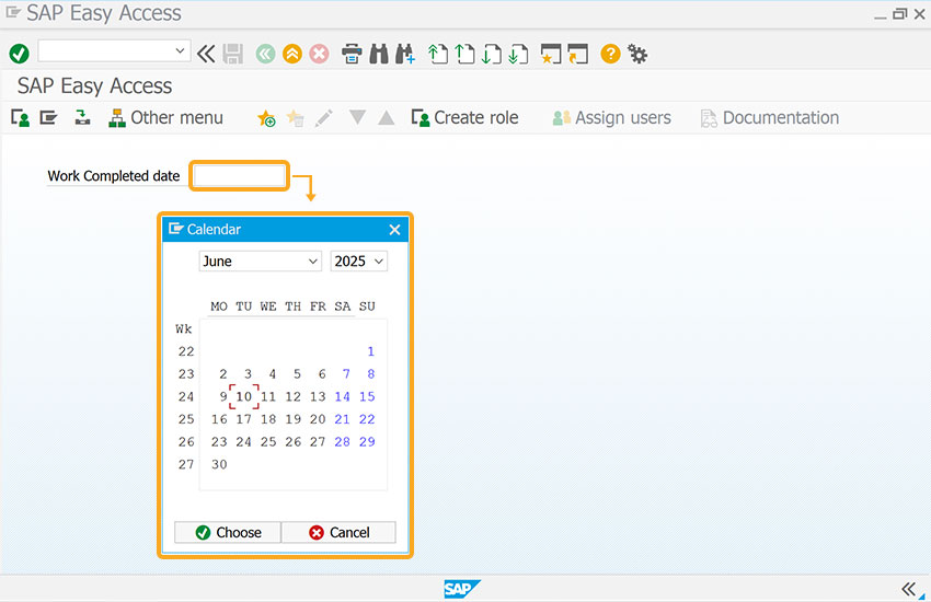
    inputfield([1,5],"Work Completed date",[1,25],{"name":"z_comp_dt","size":10,"techname":"QMEL-QMDAB"});
    
     
    Enables searchhelp-like functionality using techname when searchhelp is unavailable
     
  2. The techname option in the above code acts as a searchhelp.

uppercase

  1. The uppercase option for input fields displays values in uppercase.
     
    // Converts input field entries to uppercase 
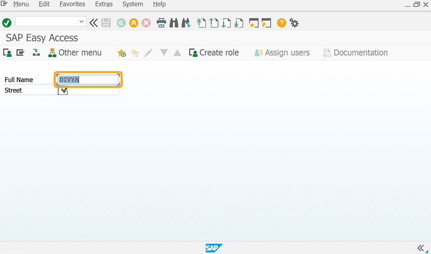
    inputfield([1,1],"Full Name",[1,15],{"name":"gx_name","size":40,"required":true,"uppercase":true});
    inputfield([2,1],"Street",[2,15],{"name":"gx_street","size":40,"required":true,"uppercase":true});
    
     
    Displays input field values in uppercase using uppercase option
     
  2. As per the code, the uppercase option transforms input field entries from lowercase to uppercase.

In addition to the mentioned options, Liquid UI WS offers additional functionalities that can be linked with the input field. These capabilities include:
 

Tool tips and icons

  1. Adds tooltips and icons to an input field.
     
    // Adds tooltip and icon to input field
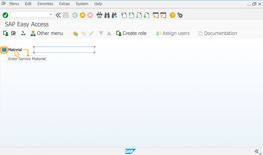
    inputfield([1,0],"@4V\\QEnter Service Material@:Material",[1,14],{"name":"g_serviceMaterial","size":25});
    
     
    adds tooltips and icons to input field
     
  2. As per the code, the Material field is displayed with an icon and tooltip, Enter Service Material on mouse hover.

Variables

  1. Two types of variables can be used with input fields: global and screen variables. Screen variables are specific to one screen, while global variables work across the SAP script.
 

Example

The following example demonstrates how the input field() is used to create material with a price constraint for a given period.

 
//Creates four input fields
inputfield([19,28],"Condition Type",[19,43],{"name":"z_vk11_conditiontype","size":20});
inputfield([22,29],"Valid to",[22,43],{"name":"z_vk11_validto","size":20});
inputfield([21,29],"Valid from",[21,43],{"name":"z_vk11_validfm","size":20});
inputfield([20,29],"Rate",[20,43],{"name":"z_vk11_rate","size":20}); 

Click here for details about how to customize the create material screen.
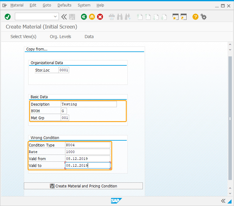
Input field example for creating material with price constraint
 

Tips and Tricks

Adding quickinfo

A quickinfo can be added to the input field using the input field command by labeling the name with an icon and tip.

//Create the SAPLSMTR_NAVIGATION.E0100.sjs file inside your script folder for customizing the SAP Easy Access Screen
//Now, add the Liquid UI script to the above file and save it

  1. Create an input labeled Reference Number.
     
    // Creates input field labeled Reference Number
    inputfield([1,0],"Reference Number",[1,25],{"name":"Z_ZMBE_REFNUM","size":10,"maxlength":"10"});
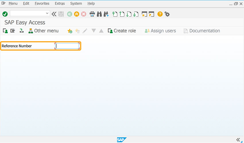
    
     
    Input field labeled Reference Number
     
  2. Add a tooltip to the input field to add contextual information for the user.
     
    // dds tooltip to the input field
    inputfield([1,37],"@01\\Qplease use the external document number as the reference number @Reference Number");
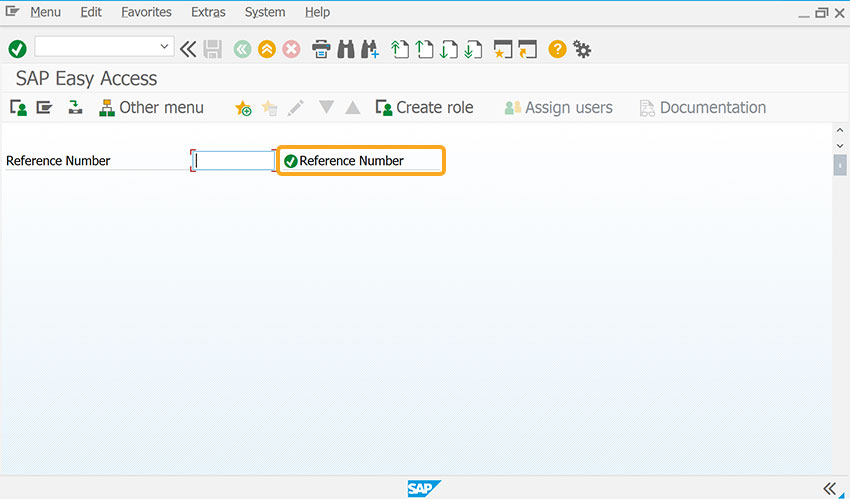
    
     
    Input field with Reference Number label and tooltip
     
  3. After refreshing the SAP screen, when the mouse hovers over the Reference Number field, it shows the tip to please use the external document number as the reference number, as shown in the image below.
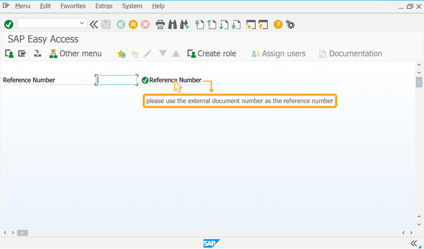
     
    Reference Number input field displaying tooltip on hover
     
Displays InputAssisant

Additionally, the Liquid UI displays the history for your new input fields. To activate this option, enable the historyononlyguixt = true; in guixt.sjs script file and save it. Enabling this option displays the popup history for both the SAP and Liquid UI created controls, as shown in the image below.
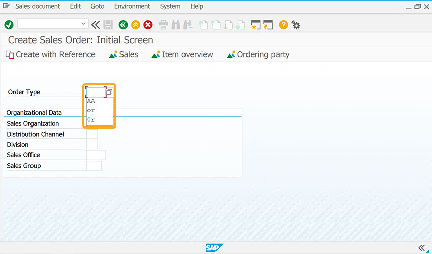
 
Enabling historyononlyguixt displays input history popup for SAP and Liquid UI fields
 
Technical Information

In standard SAP, double clicking on a field opens the Performance Assistant. By clicking the Technical Information icon, you can view the technical details of the field, such as the table name, field name, and screen number—information essential for enabling matchcode (F4 help) functionality.
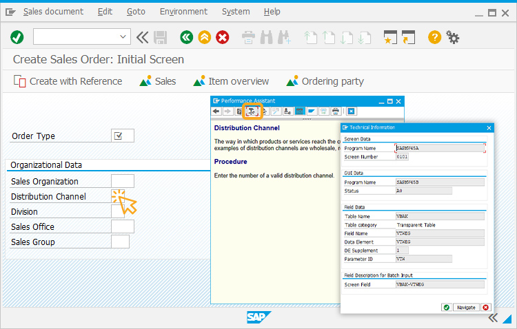
 
Double-clicking a field opens Performance Assistant to view technical details for matchcode setup
 

Usage Details


Can't find the answers you're looking for?