

Purpose
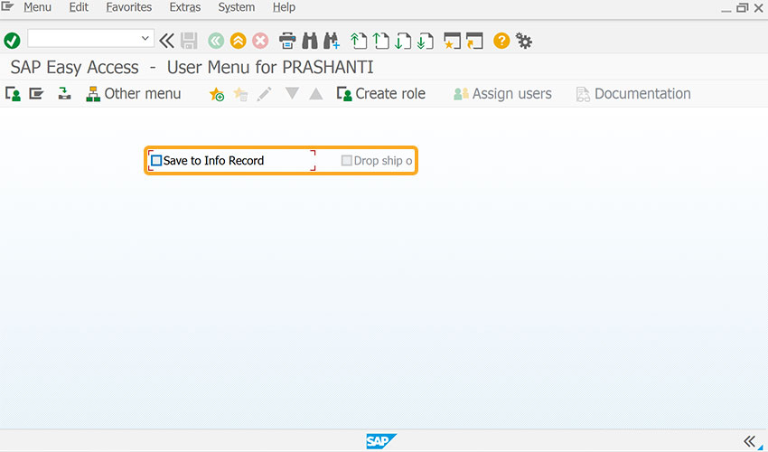
The checkbox() is used to create and customize checkboxes as needed. It is commonly used to allow users to select one or more options from a list, assign default values, and set checkboxes as read-only if required. Additionally, checkboxes can be positioned alongside other screen elements, making it easier to select multiple options within a group. In this article, you will learn about various formats and ways to use the checkbox command.

Note: Click here for details on how to position the checkbox in different ways.
Syntax
You can create checkboxes at desired locations with the required functionalities using the following formats.
Format 1: Basic checkbox placement
// Creates a checkbox at specified row and column coordinates
checkbox([row,col],"",{});
Format 2: Checkbox without options at specified row and column
// Creates a checkbox with label name at specified row and column
checkbox("[row,col]","label name");
// Creates a checkbox without options
checkbox("[10,13]","Verified");
Format 3: Checkbox relative to screen element
// Creates a checkbox relative to other elements
checkbox("F[screen element]+[row,col]","label name",{"option":value});
// Creates a checkbox with respect to the Organization Data groupbox field coordinates
checkbox("G[Organizational Data]+[1,35]","Print repair label",{"name":"print_label","default":" "});
Properties
- startrow, startcol – Co-ordinates for placement
- label name – Visible name of the checkbox
- @0Y@labelname - Name of the checkbox with icon
- @4V\\Qlable Tip@labelname- Name of the checkbox with tooltip and icon
- screen element - Specifies screen element
Available Options
You can use the following options that are available with the checkbox:
|
"default":X - Checkbox is selected by default. |
|
|
"name":"technical name" - Assigns a technical name to the checkbox for Liquid UI scripts reference. |
|
|
"offset":coordinates - The 'offset' option is used to position the checkbox relative to another screen element. |
|
|
"readonly":true - Checkbox cannot be selected. |
Options Detail
Example 1:
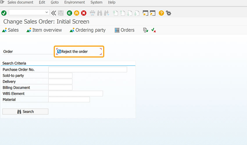
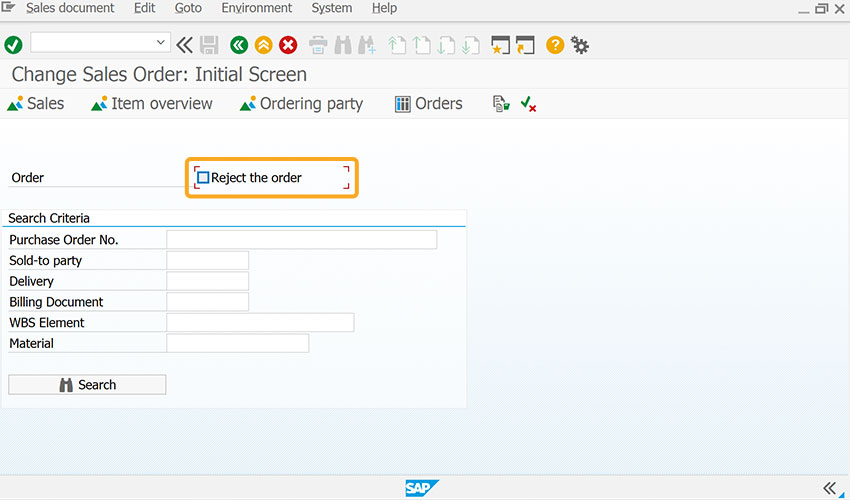
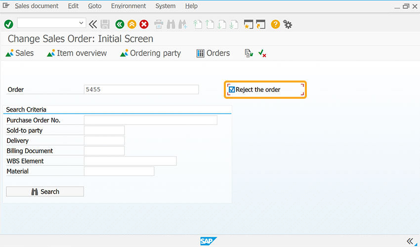
This example demonstrates how the checkbox is used to easily reject an order upon selection.
//Create the SAPMV45A.E0102.sjs file inside your scripts folder for customizing the Change Sales Order: Initial screen.
//Now, add the Liquid UI script to the above file and save it.
- Add a checkbox labeled Reject the order to reject the order upon selection.
// Creates a checkbox to reject the order
checkbox({"field":"F[Order]","offset":[0,60]},"Reject the order",{"name":"z_reject"});
- Navigate to VA02 screen, then you can see the Reject the order checkbox, as shown in the image below.
Example 2:
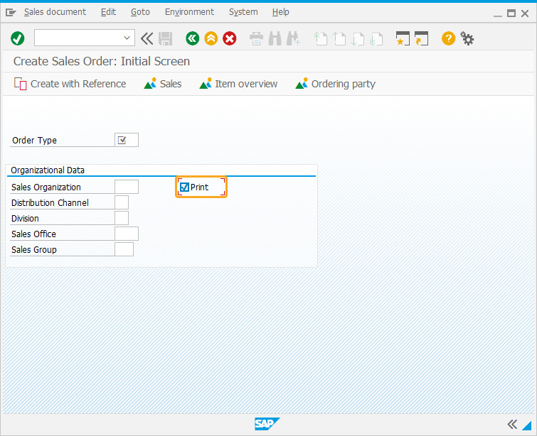
In this example, we have added a checkbox labeled Print within the Organizational Data group box of the Create Sales Order: Initial Screen.
- Add a checkbox labeled Print to print the order upon selection.
// Creates a checkbox within the group box
checkbox("G[Organizational Data]+[1,35]", "Print",{"name":"print_label", "default":" "});
Tips and Tricks
Adding tips to Checkbox
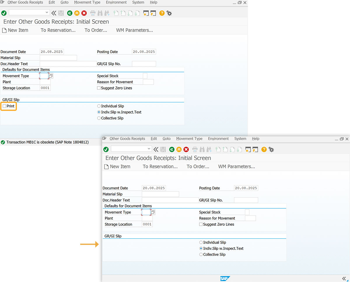
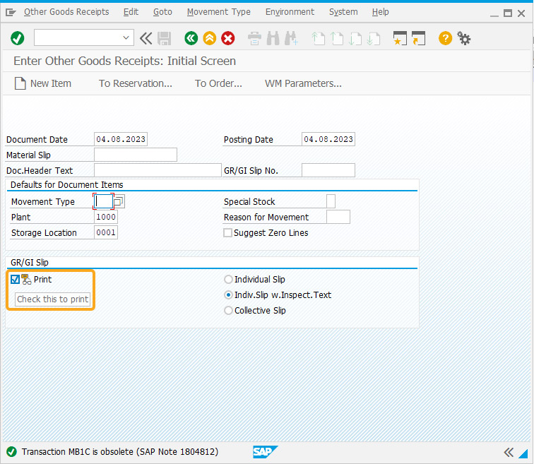
Adds a tip to the existing checkbox on Enter Other Goods Receipts: Initial Screen.
//Create the SAPMM07M.E0400.sjs file inside your scripts folder for customizing the Change Sales Order: Initial screen.
//Now, add the Liquid UI script to the above file and save it.
- Add a tip labeled Check this to print to add contextual information for the user.
 // Adds a tip to the Print checkbox
tip("C[Print]","Check this to print");
- Navigate to the MB1C screen. When the mouse hovers on the Print checkbox, it shows the tip Check this to print, as shown in the image below.
Adding a Quick info to the Checkbox
Adds an icon and tip to the checkbox
//Create the SAPLMGMM.E0060.sjs file inside your scripts folder for customizing the Create Material (Initial Screen).
//Now, add the Liquid UI script to the above file and save it.
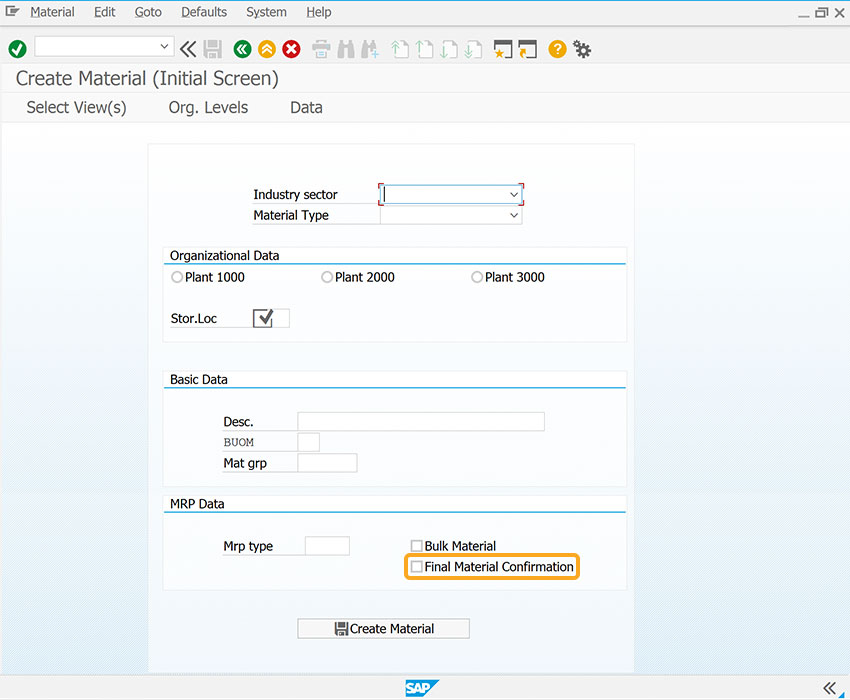
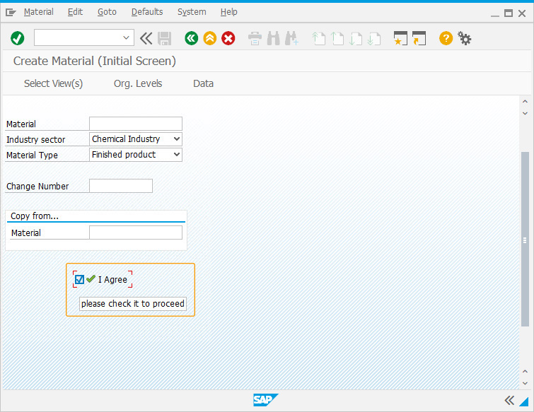
- Create a checkbox labeled I Agree and add a tip labeled please check it to proceed to add contextual information for the user.
// Creates a checkbox with a tip and icon
checkbox([11,20],"@01\\Qplease check it to proceed @I Agree");
- Navigate to MM01 screen,when the mouse hovers over the I Agree checkbox, it displays a tip please check it to proceed, as shown in the image below.
Using set command to select the Checkbox
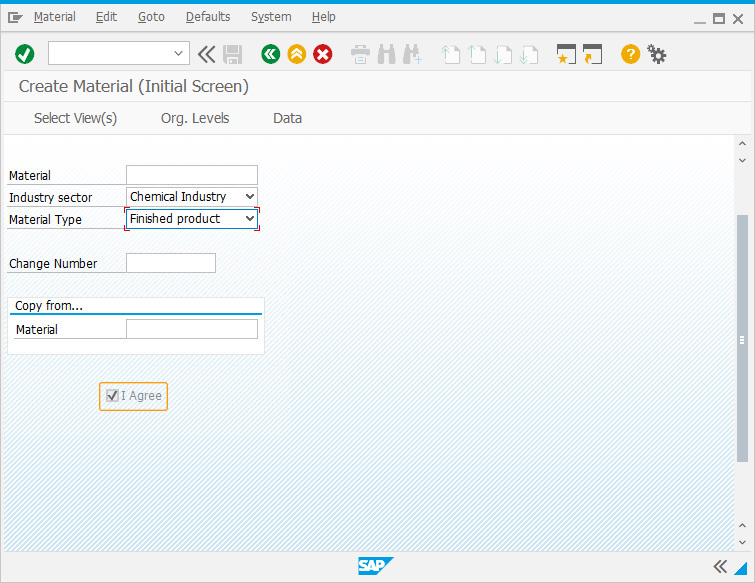
This example illustrates the usage of set() to pre-check the checkbox by setting the value to "X". Additionally, the checkbox is set as read-only to prevent selection.
//Create the SAPLMGMM.E0060.sjs file inside your scripts folder for customizing the Create Material (Initial Screen).
//Now, add the Liquid UI script to the above file and save it.
- Create a checkbox labeled I Agree and set the value as read-only to restrict it from being selected.
// Creates a checkbox and sets it as read-only
checkbox([11,15],"I Agree",{"readonly":true});
set("C[I Agree]","X");
- Navigate to MM01 screen, then you can see the checkbox labeled I Agree is pre-checked and cannot be marked since it is set as read-only, as shown in the image below.
Deletes a Checkbox
Using the del(), you can delete the checkbox on the SAP screen.
//Create the SAPMM07M.E0400.sjs file inside your scripts folder for customizing the Enter Other Goods Receipts: Initial Screen.
//Now, add the Liquid UI script to the above file and save it.
- Delete a checkbox labeled Print to remove it from the SAP screen.
// Deletes Print checkbox
del("C[Print]");