


Purpose
The radiobutton() is used to add or modify radio buttons on an SAP screen. Radio buttons allow users to select one option from a list of mutually exclusive choices. When one radio button is selected, the others in the group are automatically deselected. Radio buttons can replace input fields with predefined values, trigger actions, assign field values, or launch functions when selected. Provide a cleaner and more controlled user experience for option selection.
- Selected: Triggers a defined event.
- Unselected (' ' or empty): No action is performed.
Radio buttons determine values, replacing predefined input fields or allowing users to select fields and values that appear upon selection.

Note: You can specify the position of the radio button in different ways. Click here for details on positioning the screen elements.
Syntax
- radiobutton([row, col], "label", {options});
Properties
- row, col – Co-ordinates for placement
- label name – Visible name of the radio button
- @0Y@label name - Name of the field with icon
- @4V\\Qlabel Tip@label name - Name of the field with tooltip and icon
- screen element - Specifies screen element
You can define radio buttons using different syntax and formats based on use cases.
Format 1: Basic radio button placement
Adds a radiobutton with the label name at the desired row and column, along with the functionality provided.
// Creates a radio button label name at specified row and column coordinates
radiobutton([row,col],"label name",{"option":value…});

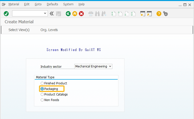
//Creates a radio button labeled Finished Product and selected by default
radiobutton([8,19],"Finished Product",{"default":"X"});

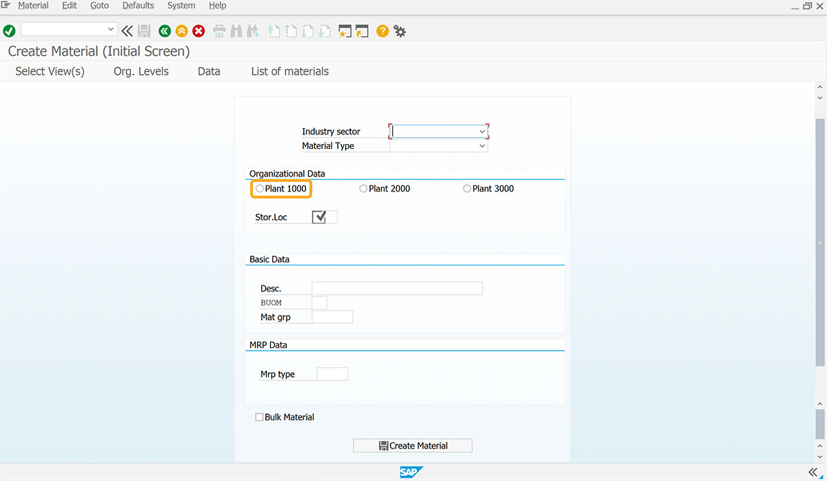
// Creates a radio button labeled Plant 1000 and z_mm01_plant as technical name
radiobutton([7,47],"Plant 1000",{"name":"z_mm01_plant"});

//Creates a radio button labeled Finished Product and runs Create_Mat process on selection
radiobutton([8,19],"Finished Product",{"name":"z_fert","[material type]":"FERT","process":"Create_Mat","default":"X"});

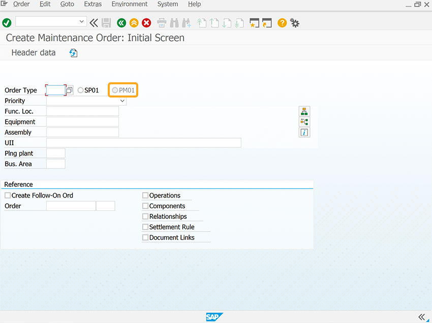
//Creates a radio button labeled Standard Order with project - ZAPP and
is disabled for selection using readonly option
radiobutton([6,2],"Standard Order with project - ZAPP",{"name":"z_get_details", "readonly":true});

//Creates radio button labeled Non Foods and assigns NOF1 value to Material type field on selection
radiobutton([11,19],"Non Foods",{"[Material Type]":"NOF1"});

//Creates a radio button Plant 2000 with value as 2000
radiobutton([7,47],"Plant 2000",{"name":"z_mm01_plant","value":2000});
Format 2: Adds a radiobutton to refer to other fields on the same screen.
radiobutton([row,col],"label name",{"F[field_name]":"value"});
// Creates a radio button Non Foods and assigns NOF1 value to Material Type field on selection
radiobutton([11,19],"Non Foods",{"[Material Type]":"NOF1"});
Format 3: Radio button with respect to other screen elements
radiobutton("F[screen element]+[row,col]","label name");
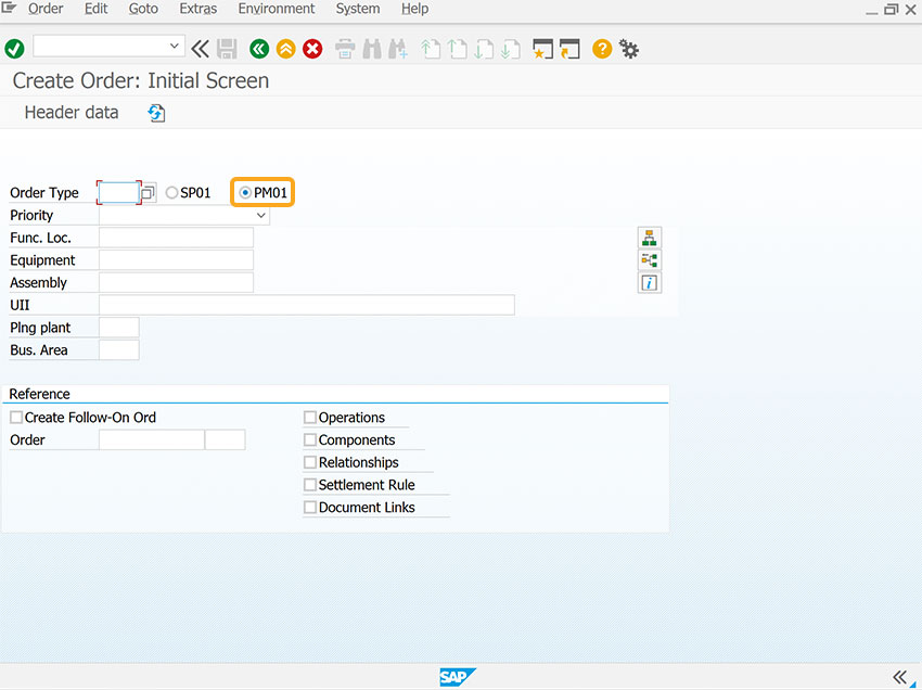
// Creates a radio button with respect to Order Type field coordinates
radiobutton("F[Order Type]+[0,19]","PM01");
Format 4: Radiobutton without options
radiobutton([row,col],"label name");
// Creates a radio button without options
radiobutton([11,19],"Finished Products"});
Available Options
You can use the following options with the radio button:
|
"default":"X" - Sets the radio button on which this option is used. |
||
|
"name":"z_radio button" - Enables users to assign a name to the radio button. |
||
|
"process":function name -Executes a function when the radio button is clicked. |
||
|
"readonly":true - Specifies that a radio button is not editable. |
||
|
"[screen_element]":"value" - Assigns a value to a screen field when selected. |
||
|
"value":"value" - Sets a value for a radio button. |
Options Detail
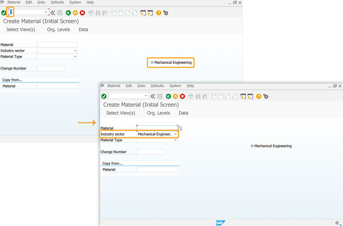
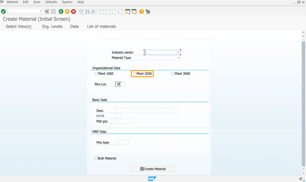
Radio button using .value property
You can send values using a radio button on the same screen through its .value property. Access the values linked to the radio button using radiobuttonname.value.
Note: You can get radio button values on another screen using their names.
User Interface
To access the radio button value on the same screen and another screen using radiobuttonname.value. Follow the steps below:
- Open the SAP Easy Access screen, select the radio button, and click Enter. You can view different values for the radio button name.value property when accessed on other screens through the onscreen command.
// Creates radio button labeled Semi-Finished Products
radiobutton([9,0],"Semi-Finished Products"{"name":"z_radio","process":z_proc,"size":10});
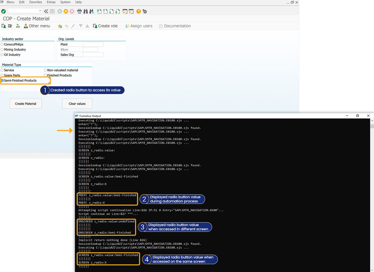
Click here for more details on how to pass radio button values on the same screen.
Example 1:
The following example demonstrates how to pass values to elements on the same screen using radio buttons.
// Creates radio button labeled Non Foods
radio button([11,19],"Non Foods",{"[Material Type]":"NOF1"});
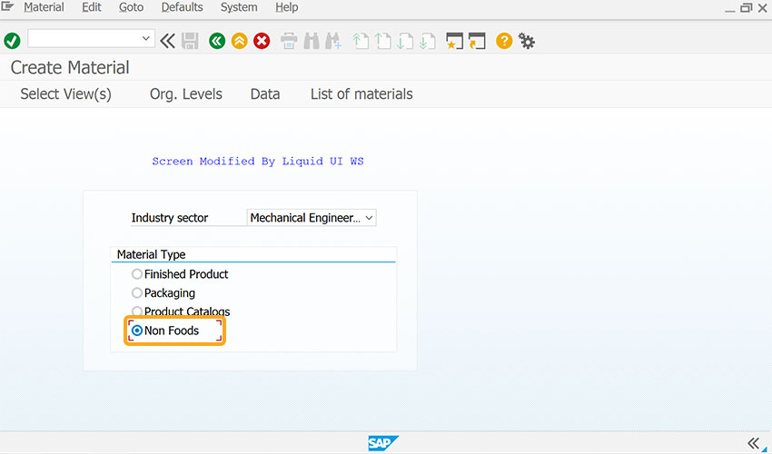
Click here for details on how to pass value from one element to another on the same screen.
Example 2:
The following example demonstrates how to create a radio button with respect to another screen element on the screen.
// Creates two radio button SP01 and PM01 with respect to Order type input field
radiobutton("F[Order Type]+[0,13]","SP01");
radiobutton("F[Order Type]+[0,20]","PM01");
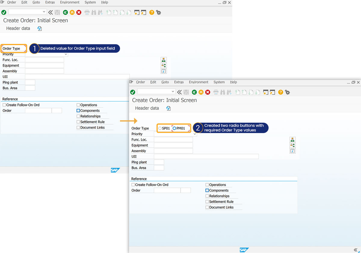
Click here for more details on how to create radio buttons with respect to other screen elements.
Tips and Tricks
Restricting User Input with radio button
When designing SAP screens for efficiency, it is often necessary to limit user input options. You can restrict user input with the radio buttons.
// Creates two radio buttons labeled Finished product and Value-only materials
radiobutton([7,45,],"Finished product",{"[Material Type]":"FERT"});
radiobutton([5,42,],"Value-only materials",{"[Material Type]":"WERT"});
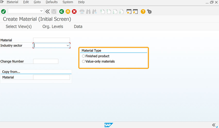
Click here for details about restricting user input with a radio button.
Radio button with input fields
You can assign multiple input fields to a single radio button. On selection, the corresponding values are passed to the input field.
// Creates a radio button labeled Get Details with respect to input fields
radiobutton([2,50],"Get Details",{"name":"z_get_details","[Order Type]":"OR","[Sales Organization]":1000","value":"10"});
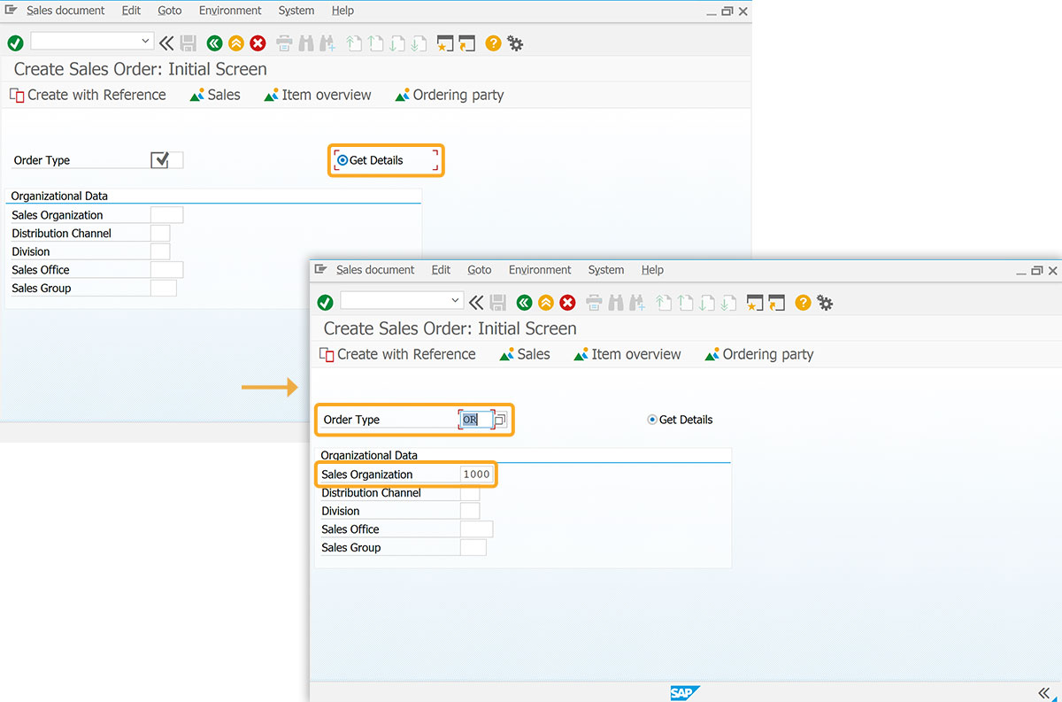
As per the code, clicking the radio button fills the input fields. The user can easily navigate to the next screen by clicking Enter.